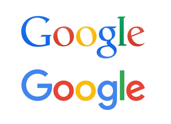
The year, 2015, can be considered as the year of major transformations for the internet giant, Google. Just some months ago, Google finally restructured its organization under Alphabet as its umbrella. Now, again, Google is back with something new, which is easily noticeable in Google Search Engine.
Here, we’re talking about the newest logo of Google which was launched just yesterday.
The new logo still retains the primary colour scheme but it has a sans-serif typeface, which is a new feature in the logo. In fact, the font by which Google’s new logo is made is ‘Product Sans’ which is Google’s own font.
According to the company, the new logo and branding have been brought out so as to show the company’s futuristic approach (Alphabet) and to improve the experience of users using different devices like mobile phone, PC, tablets etc. Along with the new logo, the company will also use a four-colour ‘G’ which replaces the previous ‘g’ icon in blue background.
On its blog, Google says, “Today we’re introducing a new logo and identity family that reflects this reality and shows you when the Google magic is working for you, even on the tiniest screens.”
Google adds, “As you’ll see, we’ve taken the Google logo and branding, which were originally built for a single desktop browser page, and updated them for a world of seamless computing across and endless number of devices and different kinds of inputs (such as tap, type and talk).”
Here’s a video that describes the long journey of Google’s logo, within a couple of minutes:


